Client Work
Share Our Strength
Redesigned the annual stakeholder presentation for Share Our Strength. Fully animated slides with cohesive graphics and impactful transitions.
Client Work
Redesigned the annual stakeholder presentation for Share Our Strength. Fully animated slides with cohesive graphics and impactful transitions.
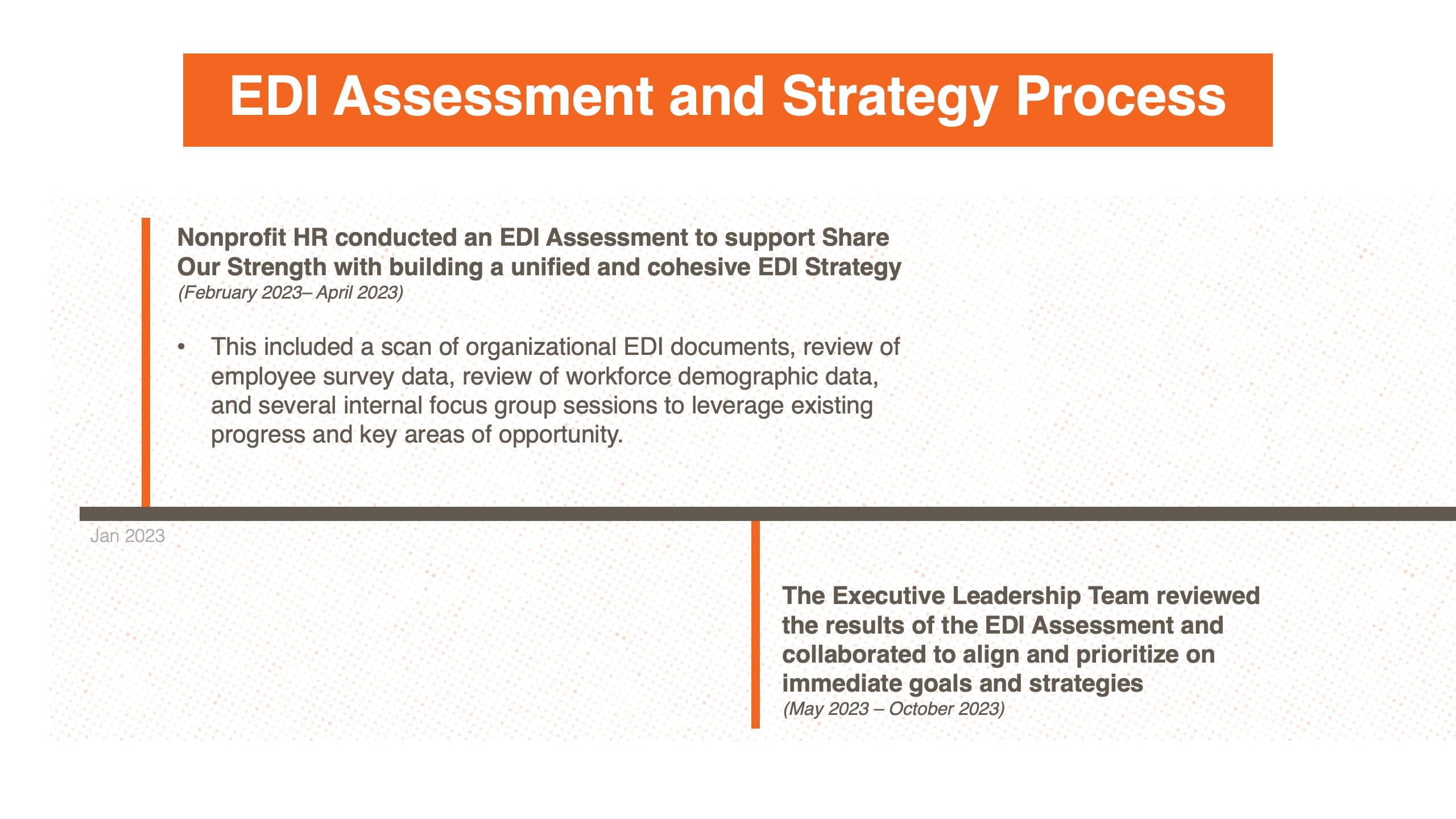
I redesigned Share Our Strength's annual stakeholder presentation on a tight deadline. The previous year's deck was functional but flat. The numbers were there, but they weren't landing. For a nonprofit where stakeholder presentations directly influence funding decisions, that's a real problem.
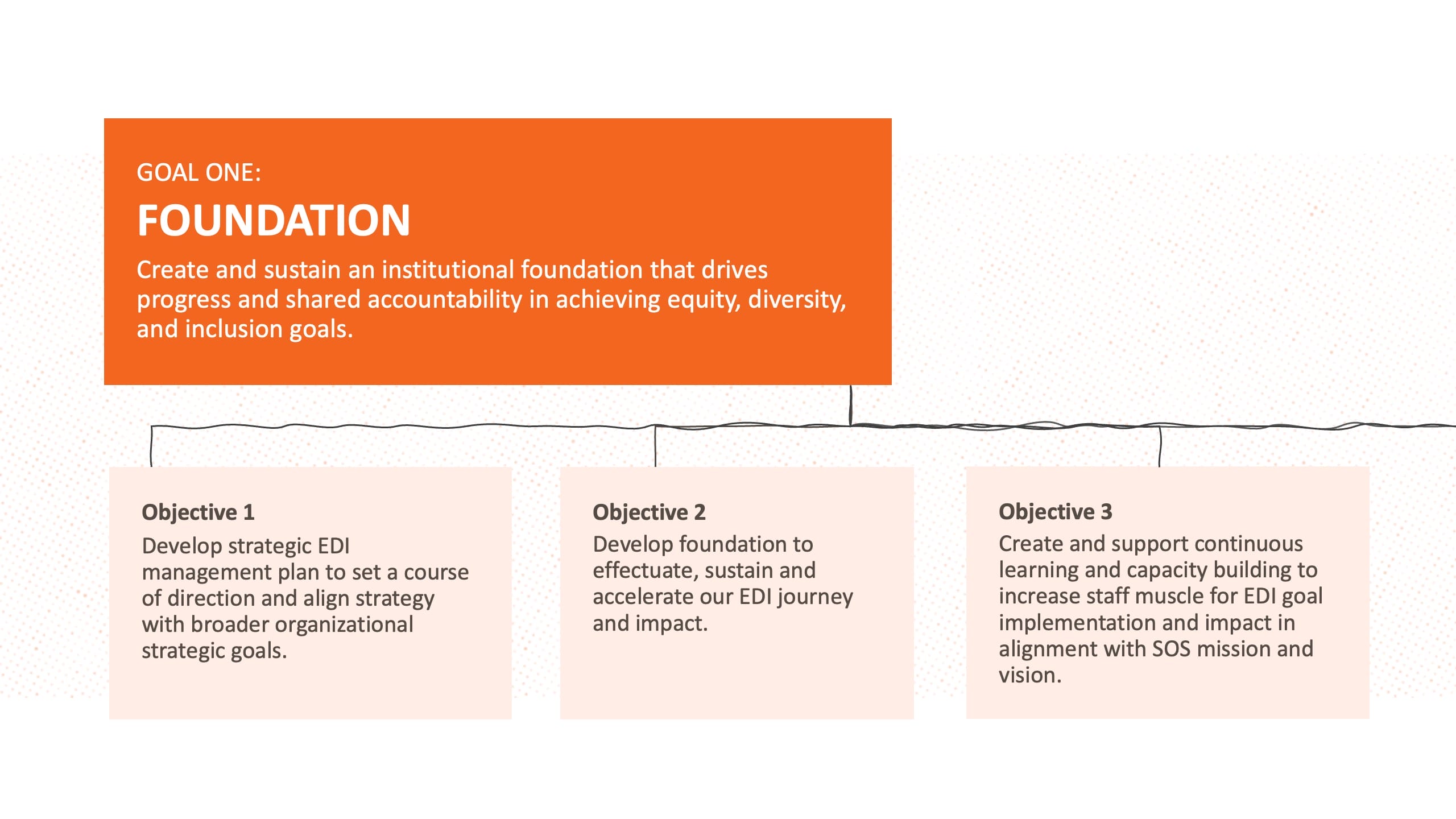
The redesign introduced motion, better data visualization, and a consistent visual language across every slide. I built the animations in After Effects and translated them into a presentation format that the team could actually use and update. The data viz was the biggest improvement. Instead of static charts, I created graphics that build progressively, letting the presenter control the reveal and keep the audience focused on one number at a time.
The visual language I established tied everything together. Colors, type hierarchy, iconography, and transition styles all followed a system. That consistency makes the difference between a deck that feels professional and one that feels like a collection of individual slides. It also meant the organization could extend the system for future presentations without starting from scratch.
Stakeholder presentations are high-stakes. The people in that room decide whether programs get funded, expanded, or cut. Making the org's impact numbers actually land with the audience wasn't just a design exercise. It was about giving their work the presentation it deserved.